The face of type
May 24, 2012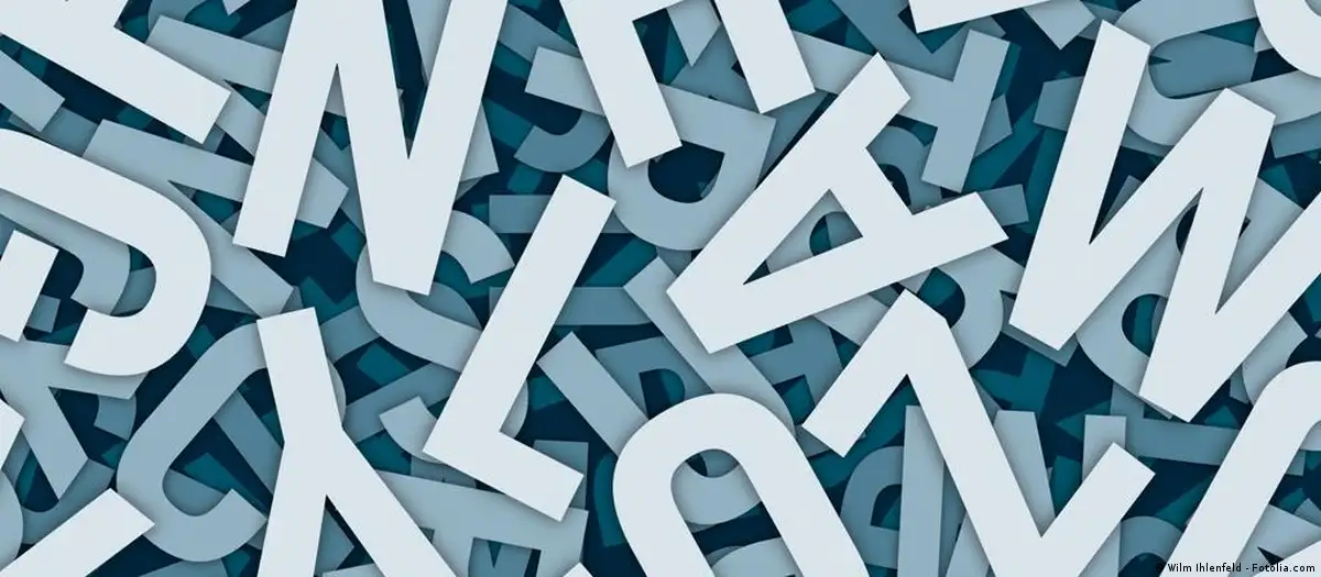
Think Times New Roman, Ariel, or Century Gothic. Beyond our basic understanding of the alphabets we use for word processing programs - or the ones we read in books, magazines or on street signage - there is a bustling network of font geeks who are literally shaping the way we think or feel about what lies beyond the letters.
Compared to 20 years ago, graphics have taken on entirely new responsibilities. They're expected to perform more and to sell more, having moved from 'on the page' to 'on the Net' in a web font revolution that extends to new creative uses, like text messaging.
With an increased demand for graphic images comes a heightened fascination in the letters that correspond.
"Young people have lived with screens all their lives so they're sometimes extremely surprised that you can actually write beautifully with your hands," said Jan Middendorp, a graphic designer and bookmaker who also writes about type. "So as people rediscover that, they might also discover type."
Alphabet city
Berlin, home to many freelancers, is a beacon for the creative class where studios are cheap to rent and baristas won't kick you out the coffee shop for working all afternoon on your laptop. So naturally, Berlin is teeming with designers who can actually afford to risk launching a business or a brand. It's not surprising that the capital is a huge hub for type designers and typographers too, who are spelling out paycheck in all kinds of ways.
But first, a lesson on terminology: Type designers actually create fonts. Typographers, on the other hand, work with pre-fabricated letters and apply them to designs.
And did you know there are actually more than 26 characters in a Latin alphabet? Ask any number of designers and they'll tell you that their typefaces have between 250 and 1,000 glyphs, or characters. It's not just about A to Z, but each typeface must also include punctuation and accents, basically every symbol that can potentially be included in a sentence.
Letters in Berlin
"I think it's one of the most satisfying things for a graphic designer when something is out in the real world, and that's really a big difference compared to books," said Fritz Grögel, co-owner of LetterinBerlin, a studio founded last November that draws lettering for book and record covers, packaging and logos, employing both hand-sketching and digitizing methods.
Along with partner and type designer Elena Albertoni, Grögel develops corporate and display fonts, as well as visual identities for companies, brands and campaigns - which can often mean working more with architectural substance.
"You're constantly in a dialogue with a real person that has a very real concept of what he's going to do in his shop, which of course has its own personality, too," said Grögel.
LetterinBerlin specializes in letter drawing, which involves making letters look good together in a sign, but not necessarily in alphabets.
"If you have a type face, every letter has to work equally well with every other letter, because they are always recombined and you have no control," said Grögel. "That's what makes type design really different from all other work relating to letters. It has to be extremely systematic and things have to refer to each other all the time."
Learn to type
According to professional opinion, the most popular trend in type design these days is type design itself. In the past 10 years, the number of type design courses has increased, with renowned master classes in Reading, UK and The Hague in the Netherlands.
Fritz Grögel also attributes its popularity to the Berlin-based Font Shop, essentially an online store for fonts. It was one of the first Internet distributors of high-end fonts which also promotes the authors behind them.
"In the 1980s nobody new the names of type designers. Today people say, 'Fred Smeijers designed a new typeface, lets check it out.' It's like fashion design," explained Grögel. "The personality of the type designer is a public figure in the graphic field, which goes back to the role of the type designer of the 1920s."
Mota Italic
Tucked away in a quiet neighbor hood in Prenzlauer Berg is Mota Italic, part-studio and part-book shop and gallery. Covering the walls are 120 Polaroid-sized photos of 'found fonts' sent in from font enthusiasts to co-owners Rob and Sonja Keller. Apart from using the building as a design studio, Mota Italic is also an exhibition space for all things type.
The company specializes in exclusive and custom fonts that are available for licensing to graphic design professionals, mostly from the United States and Germany. Their fonts are available only from their online shop.
Rob admits that he and Sonja are opposed to having their fonts on commercial distribution sites such as Font Shop and MyFonts. "Personally I don't want to be one font out of 100,000 that these sites are offering. I like this boutique aspect of how we distribute," he explained. "We're making more serious typefaces."
Sonja elaborated, saying that 'more serious' has to do with the features of the type, not the quality of the font itself. The less serious typefaces tend to be chunkier and not necessarily legible. "They're just for a shorter text, a word, a sentence, or a logo," she added. "Our type face is more for text which has much different needs, because you have to be able to continuously read it without getting a headache after two lines."
Trendy type
As for type trends, Rob and Sonja Keller cite the growing presence of Greek, Cyrillic and Arabic letters, for example, for custom projects where clients require languages outside of the Latin character sets.
"I think you can see a lot of trends in general society mirrored in type - globalization, for example, being reflected in character sets," explained Sonja.
Likely the most influential evolutionary step in the industries of type design and typography is the shift from print to digital, which forces designers to work on high-resolution screen-optimized designs and use a method called hinting, which is a set of instructions that are put into a font, essentially telling it how to behave on a screen. Not all fonts translate flawlessly from paper to computers.
The digital age has also shaped the distribution of fonts. Companies such as MyFonts, an online distribution platform for typeface that allows any type designer to upload their fonts for licensing, have become the Wal-Marts and eBays of the type world. Decades ago, designers would have to look for fonts in a catalogue or download a slim selection from what was then the early days of the Internet. These days, all fonts are distributed and licensed online, whether from a designer's personal online boutique or from a type mogul like MyFonts.
A distribution channel such as MyFonts has opened up a market of fonts to even the layman, who are now purchasing typefaces online. Type designers are benefiting by having a platform where their work, which might otherwise have gone unnoticed and unsold on the web, can be searched and licensed.
"It is a kind of Wal-Mart," explained Jan Middendorp, who also works as a graphic designer for MyFonts. "If you're Heinz ketchup everyone will think of you when they want tomato ketchup. But if you're a small boutique ketchup, then being at Wal-Mart is not necessarily bad. If you have a stand that becomes bigger when you become more successful, then more people will buy your ketchup and try something other than Heinz."
Author: Melanie Sevcenko
Editor: Kate Bowen